If you are already using Hyvor Talk, you know that it is fully customizable. By adjusting the colors, you can make a beautiful comments section on your website. In this article, I'll show you the top 5 custom designs done by Hyvor Talk users!
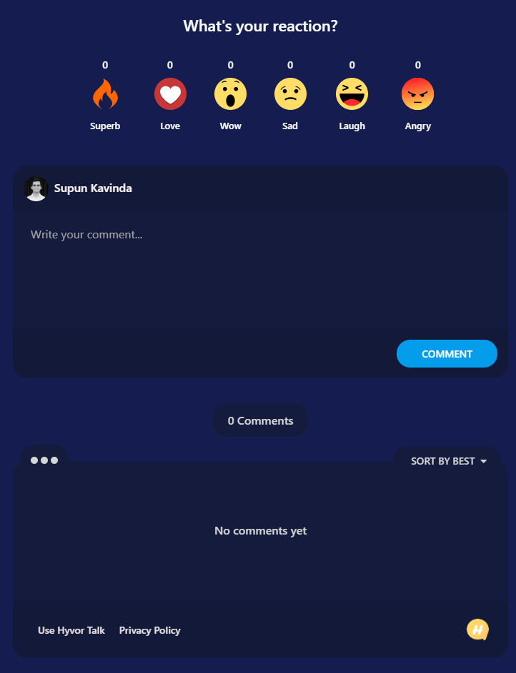
1. BettingLoupe.com
BettingLoupe's background color is blue. They have nicely customized the plugin to match their own website.
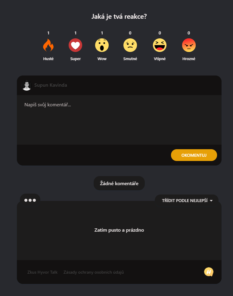
2. PixelzFairy.art
PixerlzFairy has done a great job in customizing Hyvor Talk to perfectly blend with the dark grey-ish background on their site. Who doesn't like dark colors?
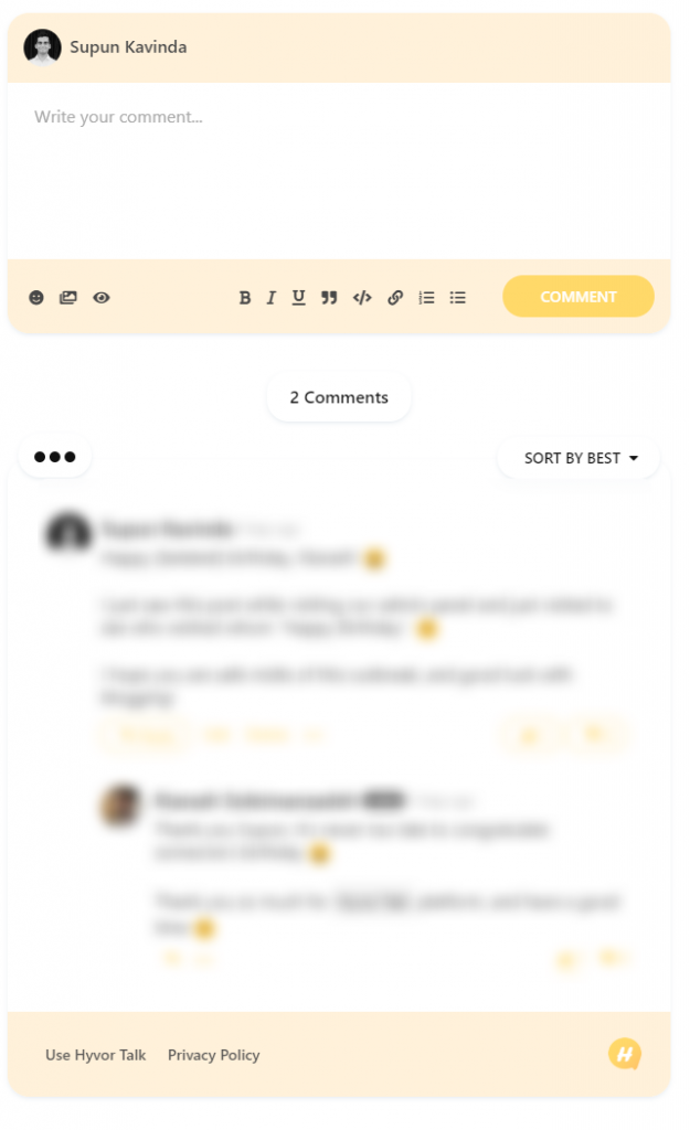
3. blog.kiarash.pro
Kiarash is a developer from Iran. He changed Hyvor Talk's design to his taste. It's so cute.
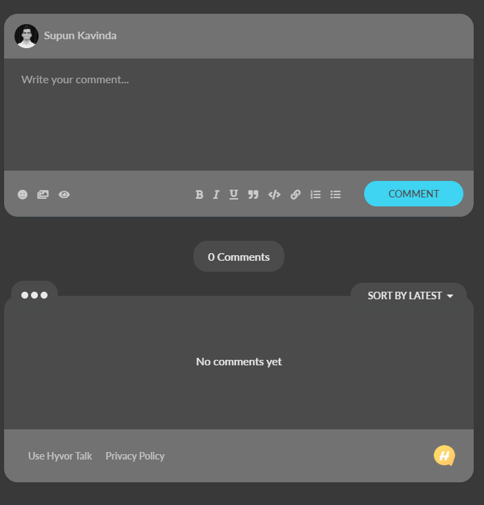
4. Petrzavodny.com
Petr Závodný is a developer, and he's customized Hyvor Talk on his site to look very professional, like his blog.
5. BlackAndBrownMakeGreen.com
Natasha and Damian run this blog to help people to gain financial literacy. See how attractive their commenting section is.
Those 5 sites are some random findings that I am personally aware of or found in our admin panel. Therefore, I may have missed some of the best custom designs of Hyvor Talk. If you have seen better ones comment below! Feel free to show off your site too (Tip: Post a screenshot as a comment).
If you haven't customized Hyvor Talk yet, you can learn more about it here✌

Comments