Comment Section Design: Examples and UX Best Practices for Websites
A reader finishes an insightful article, spots a sharp point in the discussion below, and clicks to reply. Three layers deep into a winding sub-thread, the vertical indentation blurs together, forcing them to scroll back up just to figure out who started the argument and what they originally said. By the time they trace the parent comment, the urge to contribute has evaporated, and they close the tab.
Thoughtful comment section design prevents that friction from killing an active community before it starts. How you structure reply trees, position your input box, and handle mobile viewports directly dictates whether casual readers become active participants. Below, you will find real-world examples of working comment interfaces, a breakdown of how to match layouts to reader behavior, and practical UX rules to prepare your discussion area for launch.
Comment Section Design Examples From Real Websites
Different websites solve discussion friction in distinct ways depending on their audience size, publishing cadence, and moderation resources. Some platforms prioritize rapid-fire, multi-threaded debate, while others keep conversations tightly linear to spotlight editorial picks. Looking at live implementations shows exactly how these choices play out when a reader opens a thread, drafts a reply, or scans on a small screen.
1. The New York Times: Tabbed Filtering and Editorial Highlighting
The New York Times operates a massive, heavily moderated newsroom discussion system where popular articles routinely attract thousands of submissions within hours. When a reader expands the comment drawer, the interface greets them with a sticky top bar featuring clear tabs for "All," "NYT Picks," and "Reader Picks," alongside a clean sorting dropdown. Clicking "Reply" opens a compact inline composer directly beneath the target comment, keeping the original text visible while typing.
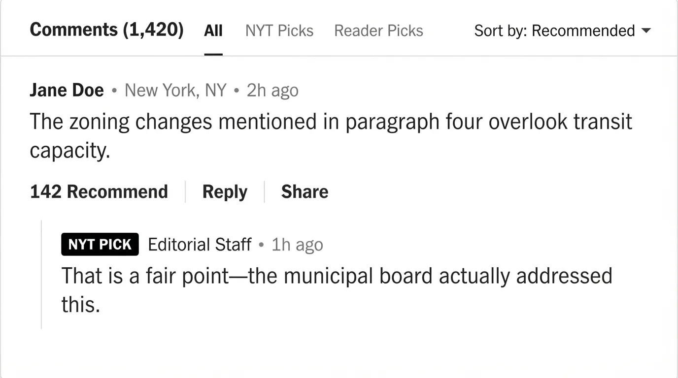
Annotated UI Concept: The New York Times separates high-signal comments via top-level tabs and distinguishes staff responses with clear visual badges.
Design choice to borrow: Use segmented filter tabs above the comment stream so readers can jump straight to curated or top-voted contributions without wading through chronological noise.
2. Hacker News: Minimalist Deep Nesting With Instant Collapse
Hacker News serves a technical community built around dense, analytical debates that frequently branch ten or more levels deep. Rather than relying on heavy borders, avatars, or card containers, it uses simple horizontal pixel indentation and a subtle [-] toggle next to every username and timestamp. When a reader wants to skip a long tangential sub-thread, clicking that tiny toggle collapses the entire branch into a single line showing how many hidden replies sit underneath.
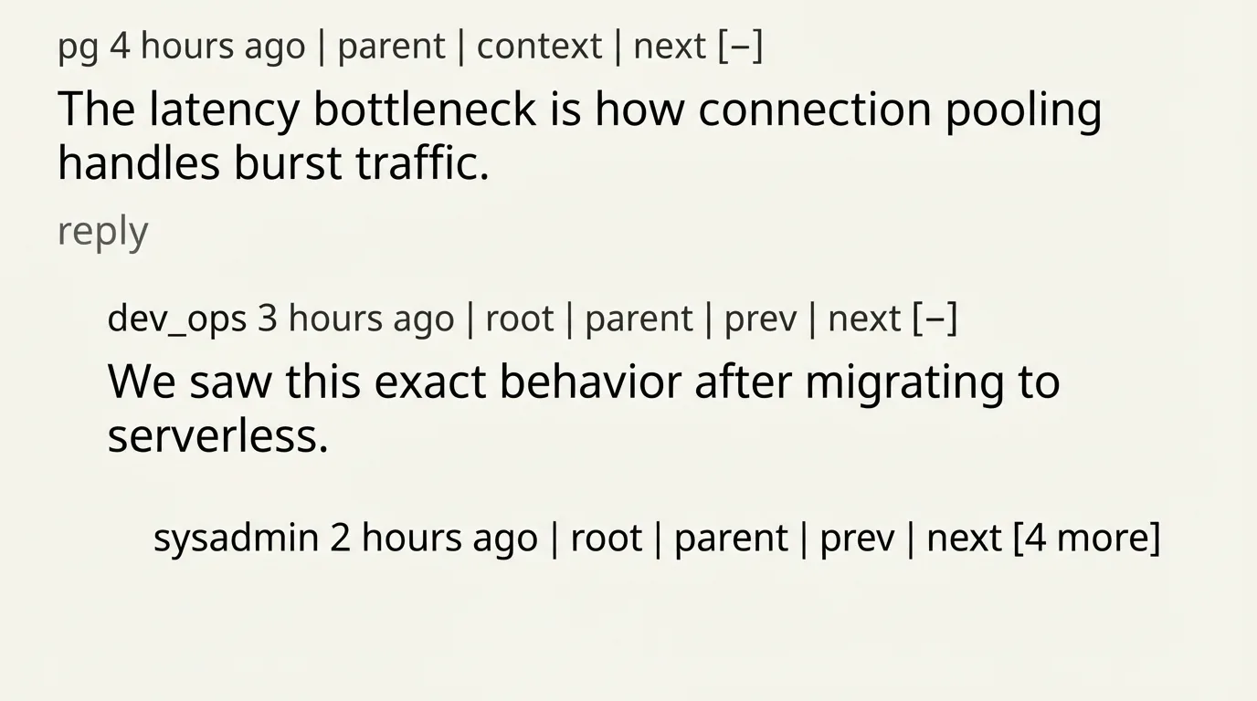
Annotated UI Concept: Hacker News relies on lightweight indentation, contextual anchor links ("parent", "root"), and single-click branch collapsing.
Design choice to borrow: Include "parent" and "root" anchor links alongside a collapse toggle on deeply nested replies so readers never lose their place in long discussions.
3. The Verge: High-Contrast Cards and Live Activity Indicators
The Verge runs an enthusiastic tech and culture community where articles spark fast-moving conversations filled with humor, product reactions, and quick follow-ups. Opening the comment section reveals distinct card containers with high-contrast author badges, clear timestamps, and bold vertical thread lines that physically connect replies to their parent posts. Tapping a vertical thread line automatically collapses that specific branch, giving mobile users a massive touch target compared to tiny text buttons.
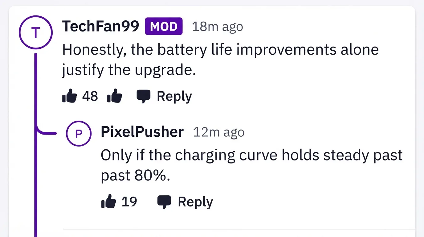
Annotated UI Concept: The Verge uses continuous vertical guide lines that act as both visual connectors and interactive collapse controls.
Design choice to borrow: Turn vertical thread guide lines into interactive hit targets so readers can collapse lengthy reply chains with a single tap anywhere along the margin.
4. Substack: Clean Progressive Disclosure and Inline Compose
Substack powers independent newsletters where writers want their comment sections to feel like intimate, distraction-free salons rather than chaotic message boards. At the bottom of a post, the comment form sits immediately visible with the author's profile avatar already queued up, inviting a quick reaction without extra clicks. Replies nest up to two levels cleanly, while deeper tangents tuck behind a "View more replies" prompt that expands smoothly in place without reloading the page.
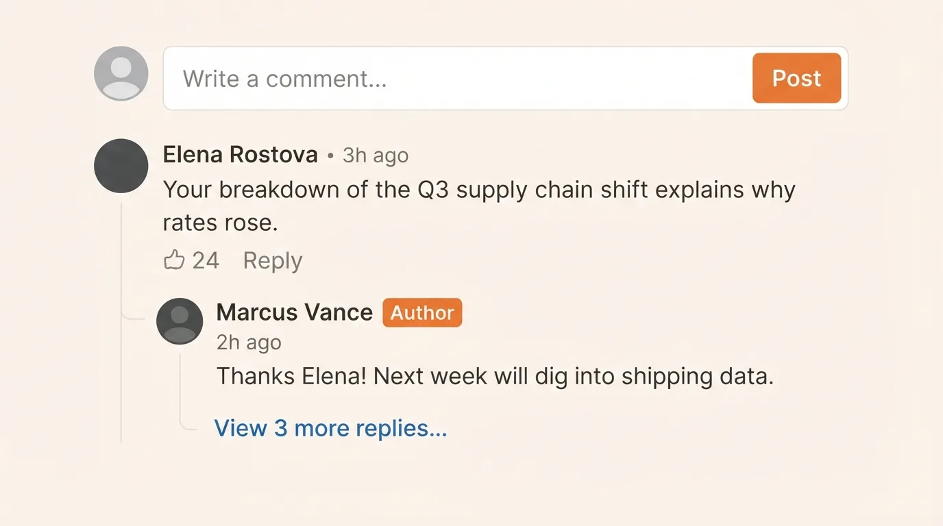
Annotated UI Concept: Substack places an open composer directly at the top of the thread and caps visible reply depth behind a clean expansion trigger.
Design choice to borrow: Keep the top-level input box open and ready immediately below the article, and highlight replies from the original post author with a distinct badge.
5. GitHub Discussions: Structured Answers and Reaction Chips
GitHub Discussions supports open-source maintainers and developer communities who use comment threads to troubleshoot bugs, debate feature proposals, and document solutions. When a reader lands on a discussion page, any comment marked as the accepted answer is pinned directly beneath the original post in a green-bordered callout box, saving users from scrolling through dozens of guesses. Readers can also react with lightweight emoji chips rather than cluttering the thread with one-word "+1" replies.
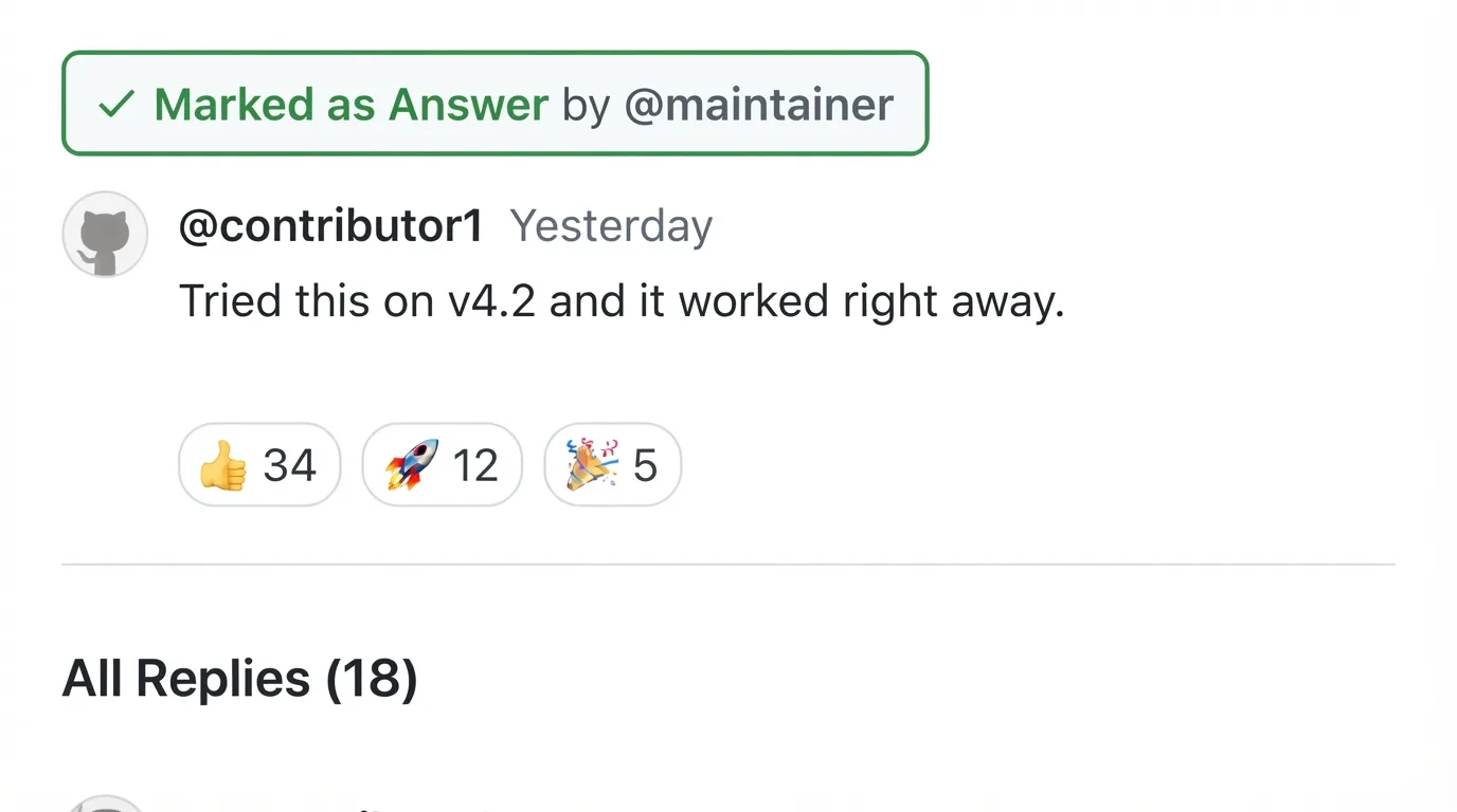
Annotated UI Concept: GitHub pins verified answers to the top and channels low-effort agreement into compact reaction chips.
Design choice to borrow: Add lightweight reaction chips (like thumbs-up or heart toggles) so visitors can express agreement without burying substantive replies under "I agree" comments.
Which Comment Section Layout Fits Your Website?
Before choosing colors, fonts, or button styles, match your comment section layout to how visitors actually interact with your content. A structure designed for rapid peer-to-peer debate will look empty and awkward on a recipe blog, while a single-column stream will quickly break down on an active news site.
Layout | Best Fit | Design Decision to Explain |
Flat list | Low-volume blogs, personal essays, tutorials, and announcement pages where readers respond directly to the author. | Keep all comments at a single visual level sorted chronologically; use |
Shallow threads (1–2 levels) | Digital magazines, newsletters, product reviews, and mid-sized publications with 10 to 200 comments per post. | Allow direct replies to top-level comments, but flatten any sub-replies into the second level so mobile screens never squeeze text into narrow columns. |
Deeper threads (3+ levels) | Community forums, technical sites, news outlets, and debate-heavy platforms with high daily engagement. | Cap visual indentation after level three or four, add collapsible branch lines, and provide a "Continue thread" view for ultra-deep conversations. |
Hybrid / Curated tabs | High-traffic publishers and Q&A hubs where signal-to-noise ratio matters more than raw volume. | Separate staff picks, verified answers, or top-voted comments into a default primary view while keeping the full chronological tree one click away. |
Comment Section UX Best Practices
Once you pick a structural layout, small interface decisions determine whether readers feel welcome to participate or abandon the form halfway through. Strong comment section UX removes guesswork about where to type, how replies connect, and what happens after you hit submit.
Place the Comment Box Where Readers Are Ready to Write
Put the primary comment form at the top of the comment section immediately after the article conclusion rather than burying it underneath fifty existing comments. Readers form their strongest reaction the moment they finish the final paragraph, so forcing them to scroll past an entire discussion just to find an input box costs you valuable contributions. Reserve bottom-of-page forms only for compact, flat threads with fewer than ten comments, and always open an inline reply box directly beneath the specific comment a user clicks to answer.
Make Comments and Replies Easy to Follow
Use clear visual anchors such as a 2px vertical thread line, subtle left padding, and distinct avatar sizes to show parent-child relationships at a glance. On desktop, indent nested replies by 24px to 36px per level; on mobile viewports, tighten that indentation to 12px to 16px and stop shifting horizontally after the second or third level. When indentation stops, rely on an explicit "Replying to @Name" tag above the message body so readers retain conversational context without sacrificing readable line lengths.
Make the Sorting Options Clear
Display the active sort order in plain language right above the comment list, defaulting to "Top" or "Best" on high-volume articles and "Newest" or "Oldest" on chronological stories. Avoid vague labels like "Hot" or "Featured" unless you explain how comments earn that placement. When a reader switches sort modes, preserve their scroll position or smoothly refresh the list in place rather than jumping them back to the top of the webpage.
Keep the Form Short and Explain What Happens After Posting
Ask only for what you strictly need to publish the comment text plus a display name or single-click social/email login and strip away optional fields like "Website URL" that mostly attract spam. If your site requires account creation, let visitors draft their comment first and trigger authentication only when they click "Post," preserving their text across the redirect. Immediately after submission, display a clear confirmation state explaining whether the comment is live, queued for moderation, or awaiting email verification.
Test the Comment Section on Mobile and With a Keyboard
Audit your comment section on a narrow 360px mobile screen to confirm that nested text blocks never wrap into two-word vertical ribbons and that every "Reply," "Upvote," and "Collapse" button has at least a 44×44px touch target. Next, unplug your mouse and navigate the entire flow using only Tab, Enter, and Escape keys. Focus states must remain clearly visible on every control, and opening an inline reply composer should automatically move keyboard focus into the text area.
Make Reporting and Moderation Visible to Readers
Place a subtle flag or "Report" option inside each comment's overflow menu (•••) alongside clear, one-sentence community guidelines pinned above the composer. When a moderator removes a comment that already has replies underneath it, replace the body with a neutral placeholder like "This comment was removed by a moderator" instead of deleting the entire sub-thread. Keeping the placeholder intact preserves context for everyone else participating in that branch.
How to Design a Comment Section for Your Website
Applying these patterns to a live site works best when you treat the comment area as a focused product feature rather than an afterthought. Follow this five-step sequence to design and ship a clean discussion experience on your pages.
Choose the main interaction: Decide whether your primary goal is collecting direct feedback on your article or fostering multi-way debates between readers. This single choice dictates your depth limits, sorting defaults, and notification triggers.
Pick the layout and default sort: Select a flat list, shallow thread, or deep tree based on your expected comment volume per post. Pair low-volume pages with chronological sorting and high-volume pages with vote- or editor-weighted sorting.
Sketch the main states: Wireframe five essential UI states before writing code: an empty thread inviting the first comment, an active multi-level discussion, an open inline reply box, a pending moderation notice, and an inline submission error.
Test a real discussion on mobile: Populate your prototype with realistic, multi-paragraph comments and four levels of replies, then test it on an actual phone. Verify that reading, collapsing branches, and typing with the on-screen keyboard feel effortless.
Roll it out on one page type: Launch the updated design on a single template such as your blog posts or news articles first. Monitor completion rates and moderation load for two weeks before expanding the component sitewide.
See How the Layout Works in Hyvor Talk
If you want to skip building nested reply trees, authentication flows, and moderation queues from scratch, you can test these exact layout choices in the Hyvor Talk live demo. Hyvor Talk is a privacy-focused comment widget that lets you configure your discussion structure directly from a visual console without writing custom frontend state logic.
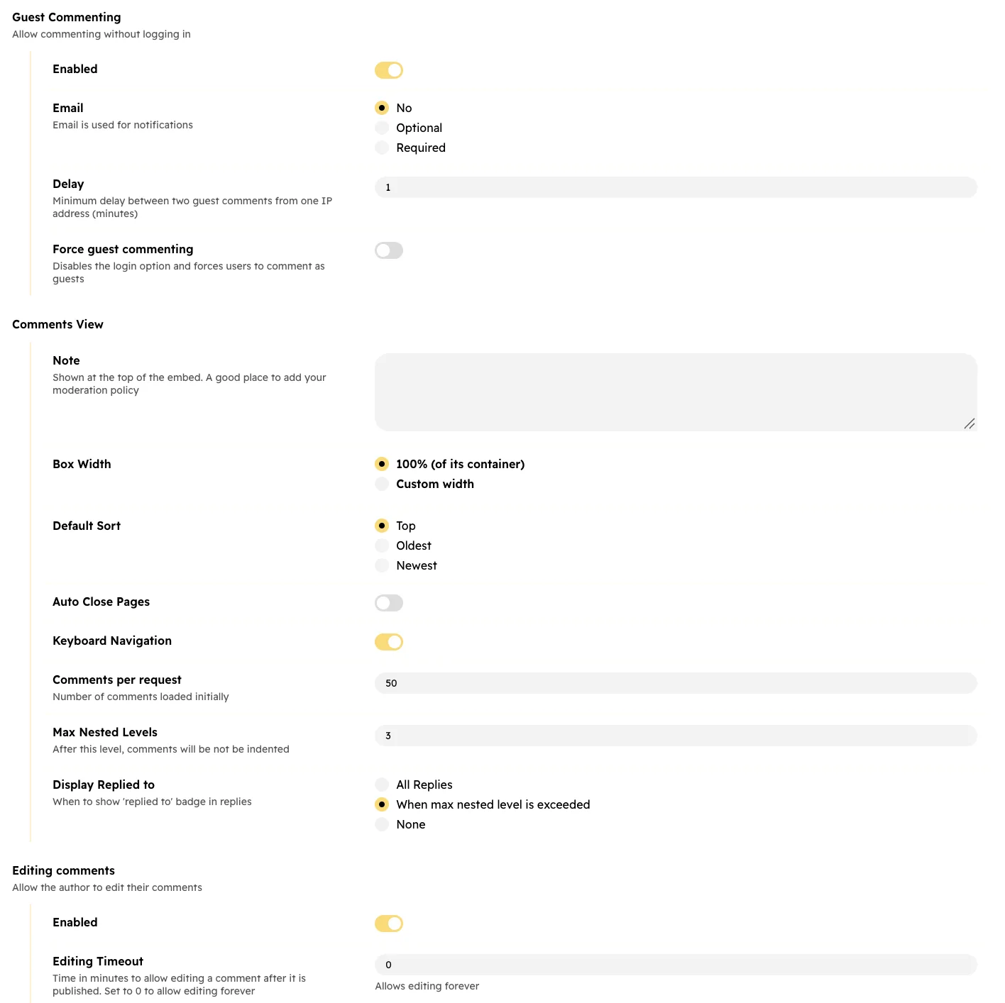
Inside the demo and customization panel, you can immediately test several of the UX patterns covered above:
Match your site's visual tokens: Automatically inherit your page's typography or fine-tune background, border, and accent colors so the widget looks native to your brand.
Control nesting depth and collapsing: Switch between flat lists, shallow two-level threads, or deeper trees, and customize how many replies stay expanded by default.
Configure friction-free posting: Toggle guest commenting on or off, enable lightweight emoji reactions, and customize the exact pending-moderation message readers see after hitting submit.
Ready to add it to your site? Copy the lightweight embed snippet from the Hyvor Talk installation documentation to deploy the configured widget on any static site, CMS, or custom web app in minutes.
How to Tell Whether the New Design Works
Launching a cleaner interface is only half the job; tracking how readers interact with it shows whether your layout changes reduced friction. Compare these three core ratios before and after your redesign to measure real engagement gains.
Measure | What It Helps You Check |
Comment section opens ÷ eligible article views | Whether readers can easily spot and open a collapsed, tabbed, or on-demand discussion drawer. |
Successful submissions ÷ form starts | Whether visitors can complete the posting flow without abandoning due to sign-in walls or form errors. |
Published replies ÷ published comments | How much of your discussion happens between readers versus isolated one-off reactions to the article. |
If your comment section sits openly below every post rather than behind a click-to-open button, track scroll-depth impressions into the comment container instead of open clicks. Always compare articles with similar traffic profiles and evaluate mobile performance separately from desktop, since small-screen layout bugs often hide inside blended averages. Keep in mind that shifts in participation can also reflect controversial topics, social media referral spikes, or stricter moderation filters rather than UI changes alone.
Return to that reader finishing your article: with a clear layout in place, they spot the comment box right below the conclusion, trace a threaded reply via a crisp vertical guide line, collapse an off-topic tangent with a single tap, and post their response in place. Before sketching a single wireframe, make one foundational call for your site: decide whether your readers are primarily answering you or talking to each other.
Frequently Asked Questions
Where should the comment box go on a website?
Place the main comment box at the top of the comment section, immediately below the end of the article content. This captures readers at peak engagement without forcing them to scroll past dozens of existing comments, while inline reply boxes should open directly underneath the specific comment being answered.
Are threaded comments better than flat comments?
Threaded comments are better for active communities where readers debate each other, while flat comments work best for smaller blogs where visitors primarily address the author. Choosing the wrong structure either creates confusing walls of text in busy threads or leaves low-volume sections looking sparse.
How many levels of nested comments should a website show?
Most websites should display two to three levels of visual indentation before flattening deeper replies or hiding them behind an expansion link. Limiting visual nesting prevents text columns from becoming unreadably narrow on mobile screens while still preserving clear parent-child context.
Should visitors be able to comment without an account?
Allowing guest commenting with just a display name or letting users draft their comment before prompting for a quick email or social sign-in significantly increases submission completion rates. If spam is a concern, pair guest posting with automated spam filtering and pre-moderation for first-time commenters rather than blocking guests entirely.
How do you design a comment section for mobile?
Reduce horizontal reply indentation to 12px–16px on mobile screens, cap nesting depth at two levels, and ensure every interactive button meets a 44×44px minimum touch target. Additionally, make vertical thread lines tappable so mobile readers can collapse long reply chains easily with one thumb.
