Not all blog layouts are created equally. In this guide, we break down proven designs, from minimalist to magazine-style, and we also explain when to use each. You’ll also learn how to apply them using Hyvor Blogs’ powerful layout theme tools.
Struggling to find the perfect blog design layout?
You’ve got great content, but your blog still looks...off. Maybe it’s hard to navigate. Maybe it feels cluttered. Or maybe it just doesn’t reflect your brand. The truth is, great blog design isn't just about looks; it's about building trust, guiding readers, and making your blog work smarter. And with so many layout options out there, choosing the right one can feel overwhelming.
In this article, we’re going to showcase the top blog design layouts that actually work, plus how to build them step-by-step using a tool like Hyvor Blogs.
But first…
Why listen to us?
At Hyvor, we specialize in helping individuals and businesses create beautifully designed blogs that are both functional and engaging. Since launching in 2020, our tools, Hyvor Blogs and Hyvor Talk, have powered countless blogs and sparked millions of conversations around the world. With that experience, we know what great blog design looks like. That’s why we’re here to showcase the best blog design layouts and how you can build them yourself.
What is blog design
Blog design is the strategic layout and visual structure of a blog that guides readers through content effortlessly. It is about clarity, flow, user intent, and aesthetics.
Effective blog design aligns your content with user behaviour. That means prioritising readability, intuitive navigation, and responsive layouts that work across devices without distracting from the message.
At Hyvor, we see blog design as the foundation of trust and engagement. A well-designed blog reduces bounce rates, increases time on page, and improves SEO. In other words, you make it easier for people to find, read, and act on your content.
Our top blog design layout examples
1. Minimalist single‑column blog layout
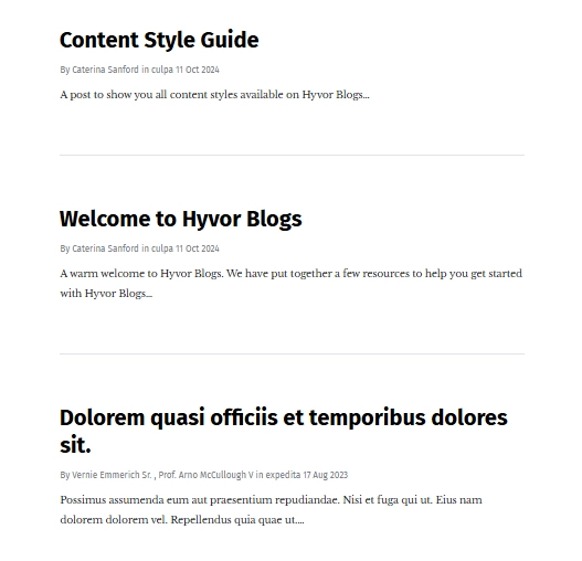
The minimalist single‑column layout is all about clarity and focus. It stacks blog posts vertically in a single, uninterrupted column, guiding the reader’s eye naturally from one post to the next. There are no sidebars or clutter, just clean, organised content that’s easy to browse. This layout is a staple for blogs that value simplicity, fast load times, and a seamless reading experience.
Key features
One-column structure that keeps the reader focused on the content
Bold, high-contrast headlines to help each post stand out
Clear post metadata (author, date) and short excerpts for quick skimming
Ample white space and generous padding between posts
Sharp typography that improves readability across all screen sizes
Visual consistency, making the blog feel modern and polished
Best for
Perfect for personal blogs, niche content sites, and teams that want to showcase writing without visual distractions. This layout works well for long-form articles, thought leadership content, and simple brand storytelling, especially on platforms like Hyvor Blogs that prioritise fast performance and clean design.
2. Magazine grid blog layout
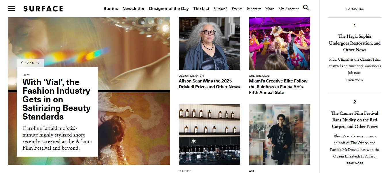
The magazine grid layout takes inspiration from editorial-style publications, like Surface, to present a visually dynamic and content-rich homepage. Instead of a single stream of posts, it showcases multiple articles at once, often grouped by category or type of story. This layout grabs attention fast and keeps readers exploring.
Key features
Multi-column, grid-based structure that highlights multiple stories
Visual hierarchy using different image sizes and headline weights
Sections for featured content, trending stories, and categories
Strong use of imagery, often paired with short excerpts
Clear navigation with top menus and story types
Sidebars for top picks, newsletters, or curated lists
Best for
Perfect for content-heavy blogs, digital magazines, and brand publications that cover a wide range of topics. Ideal for teams that publish frequently and want to highlight multiple stories at once while keeping key content above the fold. This layout suits platforms aiming for a bold, editorial feel with lots of visual variety.
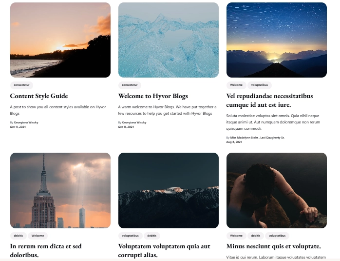
3. Image card‑based blog layout
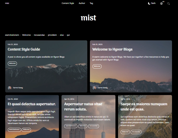
The image card-based layout organises blog posts into individual image blocks, each styled as a "card" with its own title, excerpt, metadata, and image. Seen in themes like “Mist” on Hyvor Blogs, this layout is visually engaging and helps readers scan and discover content quickly. It’s flexible, modern, and works well across devices.
Key features
Posts are displayed in a responsive grid of cards
Each card includes an image, title, excerpt, date, tags, and author info
Visually balanced layout that adapts to screen sizes
Hover effects or subtle animations to enhance interaction
Built-in tag filters and category labels for easier navigation
Strong use of imagery and concise text for quick content previews
Best for
Great for bloggers and teams with a visually rich content library. Ideal for lifestyle, travel, design, and tech blogs where aesthetics and quick skimming matter. This layout keeps the homepage organised while still offering personality through visuals and layout variations.
4. Split‑screen blog layout
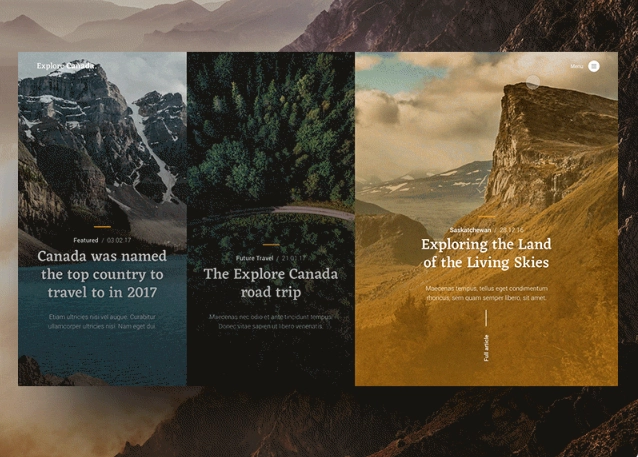
The split‑screen blog layout offers a modern, immersive experience, often used by travel and photography blogs to showcase rich visuals alongside compelling headlines. A great example of this can be seen in this Dribbble concept, where each story is given its own vertical slice of the screen, inviting readers to interact visually before diving into the content.
Key features
Dual-pane layout that presents multiple stories side by side
Large background images with overlay text for dramatic visual impactSmooth sliding transitions between stories
Minimal text at first glance, encouraging interaction to explore more
Full-screen experience is ideal for storytelling
Highly engaging UX for users on desktop and tablet devices
Best for
Perfect for travel, photography, creative portfolios, and storytelling blogs that rely on strong visuals. This layout suits creators who want to make an emotional impact and encourage readers to explore posts more deeply through an interactive experience. Best used when you have stunning imagery and want to keep your site looking sleek and cinematic.
5. Single List Layout (Text and Image Side by Side)
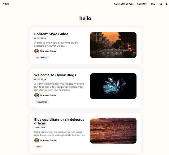
The single list layout presents blog posts in a clean vertical list, with each entry displaying the text and image side by side, which may alternate left and right for visual balance. This layout is structured and minimalist, allowing for easy scanning while still including visual context.
Key features
Posts are displayed in a vertical sequence, one after the other
Image and text sit side by side, alternating alignment per post
Each entry includes a thumbnail, title, excerpt, author, and date
Simple tag and metadata display for clarity
Clean design with rounded cards and subtle shadows
Great mobile responsiveness with stacked content on smaller screens
Best for
Ideal for personal bloggers, educators, and content creators who want a lightweight, modern look. It’s especially useful when your posts have visual elements but you want to maintain a strong focus on the writing. Perfect for how-tos, guides, and commentary-style blogs.
6. 3-column grid blog layout
The 3‑column grid layout, as seen in the Pela theme on Hyvor Blog, presents posts in a balanced, multi-column structure. It’s designed to show more content above the fold, making it easy for readers to browse multiple posts quickly. Each entry includes a featured image, title, tags, and metadata, all neatly aligned in three columns.
Key features
Grid layout with three evenly spaced columns
Prominent featured images for each post
Compact post metadata including tags, author, and date
Short excerpts for quick content scanning
Responsive design that adapts smoothly to smaller screens
Clean separation between posts, keeping the layout tidy
Best for
Great for high-volume blogs that publish frequently. Perfect for editorial teams, review sites, or visual blogs that want to maximise space without overwhelming the reader. This layout works well when you want a balance of readability, structure, and visual appeal.
7. Full‑width single column blog layout
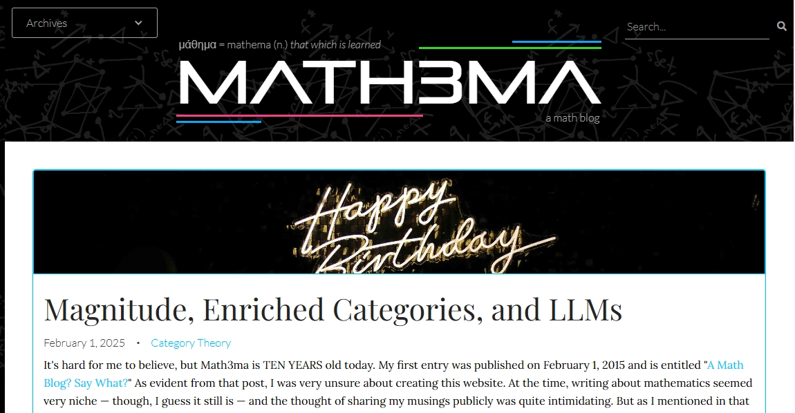
The full‑width single column layout prioritizes simplicity and focus by giving all the space to one continuous column of content. A great example of this approach is Math3ma, a math-focused blog that uses this design to keep the reader engaged with long-form posts without visual clutter or sidebar distractions.
Key features
Full-width layout with no sidebars or additional columns
Clear headline and category tagging at the top of each post
Large, readable typography for long-form content
The featured image is placed prominently above the post
Minimal styling for uninterrupted reading
Suitable for both light and dark backgrounds
Best for
Perfect for niche blogs, academic writing, technical deep dives, or any content that benefits from focused, uninterrupted reading. This layout is great for writers who prioritise substance over style and want readers to move through posts without distractions.
8. Multi-column (2 side-bar) blog layout
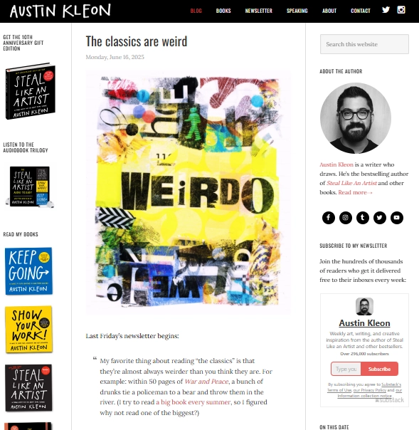
The multi‑column layout with two sidebars is a content-rich, magazine-style design that supports multiple layers of information. Austin Kleon’s blog is a strong example of this layout, with a central content column flanked by sidebars featuring books, newsletters, social links, and author details. It’s ideal for creators who want to share more than just blog posts.
Key features
Three-column structure: main post in the center, sidebars on both sides
Sidebars are used for book promos, newsletter signup, author bio, and navigation
Strong visual branding with consistent fonts and colour schemes
Highlighted featured images and distinct headline styling
Designed to balance content reading with the discovery of other resources
Works well on desktop, with simplified stacking on mobile
Best for
Perfect for authors, creators, and marketers who need more than just a blog feed. This layout suits personal brands with products, newsletters, or social content to promote. Great when you want to build an audience around both content and personality without overwhelming the reader.
How to create a user-friendly blog design layout on Hyvor Blogs
Designing a clean, engaging, and user-friendly blog layout doesn’t have to be complicated. With Hyvor Blogs, you get access to a powerful blogging platform that’s intuitive, flexible, and packed with professionally designed blog layouts.
Follow the simple steps below to create your ideal blog design layout using Hyvor Blogs:
Step 1: Create a Hyvor Blogs account
First things first, head over to Hyvor Blogs and click “Start your blog”.
Complete the sign-up form with your name, email, and password.
You’ll automatically start with a 14-day free trial, no credit card required. This gives you full access to explore and test out all the features before making a commitment.
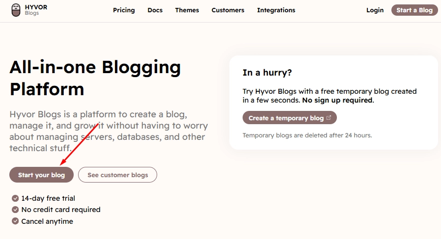
Once registered, you’re ready to create your first blog.
Step 2: Start a new blog
After signing in, Hyvor will prompt you to name your blog and choose a subdomain.
Name your blog: Choose a name that reflects your content’s purpose or audience. This can always be changed later, but it’s good to start strong.
Set your subdomain: This will be used as the URL of your blog on Hyvor’s platform (e.g., yourblogname.hyvorblogs.io). Only letters, numbers, and hyphens are allowed.
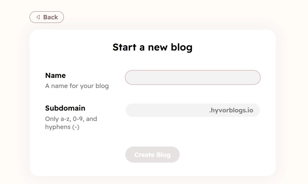
Pro tip: Make sure your blog name and subdomain are easy to remember and aligned with your brand.
Once everything looks good, click “Create Blog.” Hyvor will take a few seconds to set everything up for you.
See our full guide on how to add a blog to your website.
Step 3: Customize your blog design
Now the fun part, choosing and customizing your blog’s design layout.
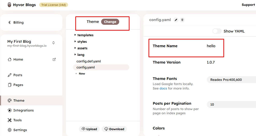
Once your blog is created, you’ll land in the Hyvor Blogs dashboard. On the left sidebar, click on the “Theme” tab. This will open a design panel on the right showing your current theme. By default, it’s called Hello.
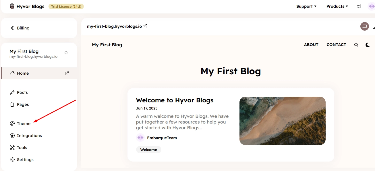
To change your layout:
Click the “Theme: Change” button.
You’ll see a curated list of over 15+ professionally designed themes, each optimized for readability, performance, and conversions.
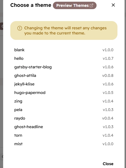
Simply pick the one that matches your content style, no coding skills needed.
From minimal personal blog layouts to content-heavy magazine styles, there’s a theme for every use case.
Step 4: Advanced theme customization (optional)
If you’re code-savvy or working with a developer, Hyvor gives you full access to customize your theme even further:
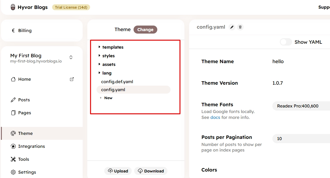
After selecting a theme, you’ll find several editable files in the Theme panel.
The config.yaml file controls theme settings like fonts, colors, spacing, and layout options.
You’ll also see the full set of HTML-like templates in the templates directory, perfect for fine-tuning your blog’s look.
Hyvor is always expanding its theme library, so new layouts are added regularly.
Want to explore all the available themes? Browse them here
Step 5: Preview and customize your blog design
After selecting your blog design, return to the main dashboard. Here’s where you get to see your blog in action and fine-tune the experience:
Use the Preview pane to view your blog across different pages (homepage, blog post pages, tag pages, author pages, etc.).
Test how your blog looks on mobile and desktop to make sure your layout is responsive and clean across all devices.
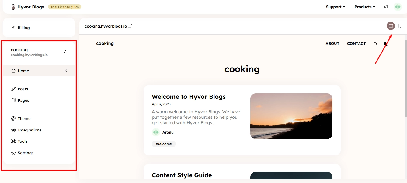
Once satisfied with the overall structure, it’s time to personalize further using the left pane menu:
Add and organize pages like About, Contact, or Services.
Start writing blog posts using Hyvor’s rich text editor.
Explore the Tools and Integrations tabs to connect services like Hyvor Talk.
Adjust Settings for your domain, SEO, and language preferences.
Best practices for creating effective blog layouts
Keep it simple and focused
Avoid clutter. Your blog should guide the reader’s eye from headline to content to call-to-action without distractions. Stick to clean lines, consistent font styles, and plenty of white space to create breathing room.
Prioritize readability
Choose fonts that are easy to read and maintain a good contrast between text and background. Use short paragraphs, subheadings, and bullet points to break content into digestible chunks.
Make navigation effortless
Your layout should help visitors find what they’re looking for quickly. Include a visible menu, clear categories or tags, and a search bar. With Hyvor Blogs, navigation components like menus and content grouping are easy to manage from the dashboard, no extra plugins or coding needed.
Choose a mobile-responsive design
Most readers will visit your blog on a phone or tablet. Use a layout that adapts smoothly across devices. Hyvor’s themes are all mobile-friendly out of the box, so your content always looks good, no matter the screen size.
Use visual hierarchy to guide attention
Arrange content to highlight what matters most. Use larger font sizes or bold headers for important messages, and place key elements (like CTAs or subscription forms) above the fold to maximize visibility.
Streamline your blog layout creation with Hyvor Blogs
A great blog layout doesn’t just look good; it shapes how your content is consumed and remembered.
With Hyvor Blogs, you don’t need to be a developer to build a professional-looking blog. Choose from 15+ clean, mobile-friendly themes, customize your design easily, and manage everything from one intuitive dashboard. If you prefer full control, you can even edit theme files directly. It’s flexible, privacy-first, and built for creators like you.
Ready to launch a blog that looks great and performs even better? Start your free 14-day trial on Hyvor Blogs, no credit card required.
Read more…
Corporate Blogging: The Ultimate Guide for Corporate Blogs A to Z
End-to-end Marketing and end-to-end content marketing and strategy
Best Blogging Platform: Guide to Choose the Best Blogging Platform
The Ultimate Blog Post Checklist: Ensure Success with Every Blog Post
Headless Blogging: Astro, Next.js, Svelte/Sveltekit, Nuxt

Comments